Thursday, March 19, 2009
Form Filling Loses Over Half of your Customers
When it comes down to getting your cold hard cash from a customer there's one trial that stands in the way. The endless pages of checkout forms which looses on average 59.8%. It's a death march, it's not pretty and, frankly, we all can do better.
The usual process goes something like this:
1. Choose the Software Product
2. Ask about Updates, CD, Download Service, Cross-sell items
3. Enter Personal Info
4. Enter Payment Option
5. Enter Shipping Details
6. Confirm
7. Checkout
That's seven steps which can all throw errors and throw the customer out.
So what's to be done about it? The knee-jerk approach of in-page or new window popups on abandonment simply don't work and just infuriate customers. What's needed is a little finesse and an eye to the future.
Streamlining the Process
I was talking to @algirhythm who advised me that streamlining pages for user's eyes can have a vast improvement on the readability of pages, and can retain customers through the registration process.
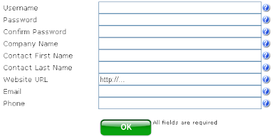
So a quick quiz, which form do you think is the easiest for a customer to fill in, this:
or this:
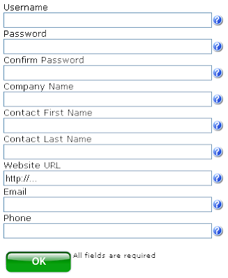
The answer might surprise you, but based on eyeball tracking test software the second form is significantly easier. This is because the user just has to scan straight down, instead of left and right. Combine this with the user having to move the mouse, type, look away and find their credit card and you can see how this is true. This simple technique can help retain customers.
Clickability
Applying the 'simple is beautiful' mantra throughout the registration process it also makes sense for 'OK' buttons to be big and clickable, and 'Cancel' buttons to be simple text links.
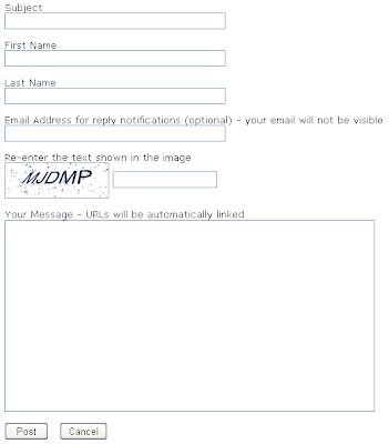
Compare this:
To this:
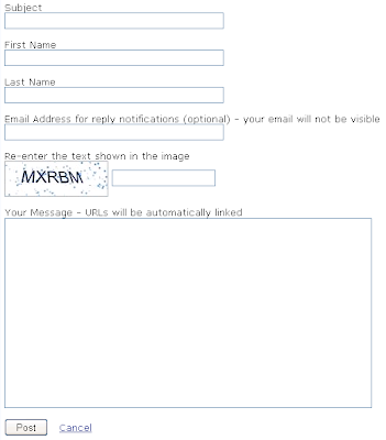
In the first screenshot the 'Cancel' button is equally as important as the 'Post' button, but in the second it's obvious where to click. The user does not have to think and less mistakes will be made. Again apply this thinking and it will subtly reinforce the 'correct' behavior that you want your customers to do during the checkout process, and hopefully you'll get more sales.
No Reset
I've always had a loathing for the pointless 'Reset' button that's sadly still used on some forms:
This is even worse than having a 'Cancel' button as when it's clicked the user cannot use the browser's 'back' button to get their information back. I've never seen a place where it should be used and I'd lobby to have it permanently dropped from the HTML spec!
Futureshock
In the future "Social networks will be like air", or so says @charleneli at her recent SXSW presentation. We'll we may be a few years off from having Google powering our sock draw, and Microsoft lightbulbs, but we are starting to get some tools that can help the death-march of registration screens and customer loss.
The web as it exists today is powered by 'registrations', and slowly we are starting to move to an 'identity' model. With services such as Facebook Connect the whole process of registration is side-stepped. Users don't have to fill out the long signup form, they just have to use their existing "Identity".
Of course this all relies on trust, so it remains to be seen if collectively we will trust services like this when integrated into e-commerce systems. Over the next few weeks and months we may find that we're re-writing our shopping cart systems to use technology such as this, hopefully with at least one less hoop for the customer to jump through.
The usual process goes something like this:
1. Choose the Software Product
2. Ask about Updates, CD, Download Service, Cross-sell items
3. Enter Personal Info
4. Enter Payment Option
5. Enter Shipping Details
6. Confirm
7. Checkout
That's seven steps which can all throw errors and throw the customer out.
So what's to be done about it? The knee-jerk approach of in-page or new window popups on abandonment simply don't work and just infuriate customers. What's needed is a little finesse and an eye to the future.
Streamlining the Process
I was talking to @algirhythm who advised me that streamlining pages for user's eyes can have a vast improvement on the readability of pages, and can retain customers through the registration process.
So a quick quiz, which form do you think is the easiest for a customer to fill in, this:

or this:

The answer might surprise you, but based on eyeball tracking test software the second form is significantly easier. This is because the user just has to scan straight down, instead of left and right. Combine this with the user having to move the mouse, type, look away and find their credit card and you can see how this is true. This simple technique can help retain customers.
Clickability
Applying the 'simple is beautiful' mantra throughout the registration process it also makes sense for 'OK' buttons to be big and clickable, and 'Cancel' buttons to be simple text links.
Compare this:

To this:

In the first screenshot the 'Cancel' button is equally as important as the 'Post' button, but in the second it's obvious where to click. The user does not have to think and less mistakes will be made. Again apply this thinking and it will subtly reinforce the 'correct' behavior that you want your customers to do during the checkout process, and hopefully you'll get more sales.
No Reset
I've always had a loathing for the pointless 'Reset' button that's sadly still used on some forms:
This is even worse than having a 'Cancel' button as when it's clicked the user cannot use the browser's 'back' button to get their information back. I've never seen a place where it should be used and I'd lobby to have it permanently dropped from the HTML spec!
Futureshock
In the future "Social networks will be like air", or so says @charleneli at her recent SXSW presentation. We'll we may be a few years off from having Google powering our sock draw, and Microsoft lightbulbs, but we are starting to get some tools that can help the death-march of registration screens and customer loss.
The web as it exists today is powered by 'registrations', and slowly we are starting to move to an 'identity' model. With services such as Facebook Connect the whole process of registration is side-stepped. Users don't have to fill out the long signup form, they just have to use their existing "Identity".
Of course this all relies on trust, so it remains to be seen if collectively we will trust services like this when integrated into e-commerce systems. Over the next few weeks and months we may find that we're re-writing our shopping cart systems to use technology such as this, hopefully with at least one less hoop for the customer to jump through.
Subscribe to:
Post Comments (Atom) 

0 comments:
Post a Comment